


If you aren’t familiar with me, my name is Jake Meeks and I founded the Fireside Tattoo Network in 2013 with the focus of “Blurring the Lines between Tattooing and Fine Art”
Our content is primarily focused on helping tattoo artists hone their skills.
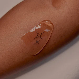
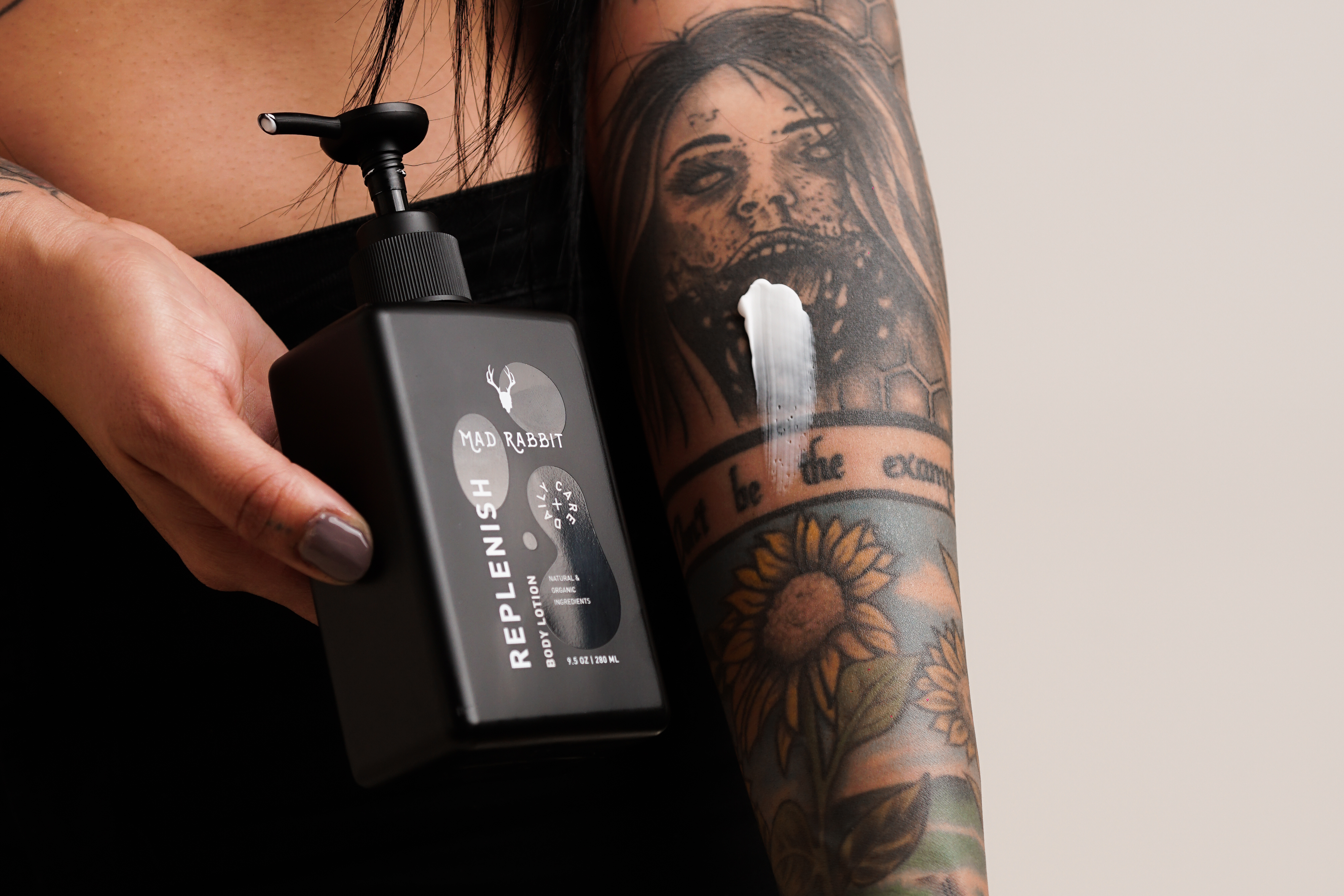
MadRabbit, as you probably know, has mostly focused on tattoo longevity for the client, offering products that help “Revitalize, Replenish, and Restore” tattoos.
Through this partnership, we hope to meld our individual expertise to become a tattoo education powerhouse and we hope you’ll come along for the ride!
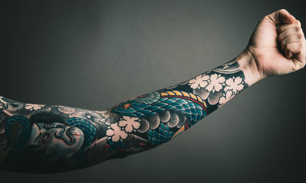
The first concept I would like to introduce is often perceived as one of the most important elements of a great tattoo. Bright Colors!
The key to achieving bold, bright color in your tattoo is based on a few principles and (maybe surprisingly) has very little to do with the inks that you are using.
Principle 1-Value Contrast
If you were to photograph your color tattoo and use a black and white filter to remove the color, you will see where those bright colors sit on a value scale.
The single most important choice a tattoo artist can make when choosing colors is:
Which colors are dark and which colors are light?
Placing darker colors near lighter colors will immediately increase the contrast in the design and drive the viewer’s attention to those areas
Principle 2-Color Intensity
In addition to creating value contrast by using dark colors near light colors is the intensity of the colors you choose.
Using two very bright colors next to each other will tend to cancel each other out.
However, Using one very bright, high key color against a muted or “grayed down” color will cause the high key color to appear much brighter on the skin.
Principle 3-Complementaries
The use of complementary colors can be a simple and powerful way to achieve color contrast.
Complimentary colors are colors that sit opposite each other on the color wheel.
Examples of complimentary colors would be blue/orange, red/green, yellow/purple.
You might notice in these examples,
-the first color listed is a primary color (red/blue/yellow)
-and the second color listed is a secondary color (orange/green/purple).
If you dig a little deeper, you’ll see that the complementary color of the primary, is simply the secondary color created when the other 2 primaries are mixed together. (ex, primary color-Blue, complimentary color-orange -Red+yellow=orange)
If you apply these 3 principles together (ex, dark muted blue/light bright orange) you will be a little closer to unlocking this color superpower.
Now there are other principles at play here but I don’t want to add complexity. Instead, I would like to share a simple tip that you can immediately apply using the principles above to simplify this concept.
This is a video from our 3 Minutes to Better Tattooing series and I think it will be a useful, visual example of how you might apply these principles to achieve bold, bright color in your tattoos.
Use This Color Trick in Your Next Tattoo
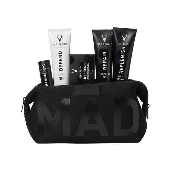
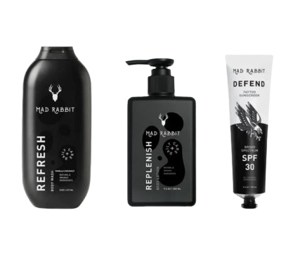
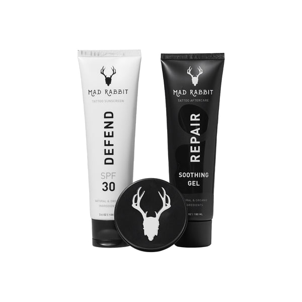
Try risk-free & save with the Essential Sets

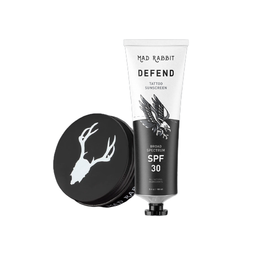
Daily Defense Set

Featured Posts
Join the discussion